Shopify Product Page Checklist: 7 Fixes That Convert
A high-converting Shopify product page checklist: 7 fixes—hero image, reviews above the fold, sticky add-to-cart, benefit copy, shipping clarity, trust, and speed.
Your Shopify product page is where the sale is won or lost. Ads and SEO can pour traffic onto a PDP, but if the page does not answer the buyer's questions in the first few seconds, that traffic bounces and your ad spend leaks. This Shopify product page checklist distills the seven fixes that move the conversion-rate needle most—the same high-converting product page framework our CRO and Shopify development team applies on client stores. Work through it once per top product; you will usually find two or three quick wins on day one.

Prefer the printable version? Download the free High-Converting Shopify Product Page Checklist (PDF)—one page you can keep next to your screen while you audit each PDP.
What's inside this checklist
- The seven product page elements that most influence add-to-cart and checkout rate
- Where to place reviews, trust signals, and shipping info so buyers see them without scrolling
- The mobile-first fixes (sticky add-to-cart, page speed) that matter because most Shopify traffic is mobile
- Common product page mistakes that quietly cost you sales
- A simple "what good looks like" benchmark to score your own PDPs
The 7 fixes for a high-converting Shopify product page
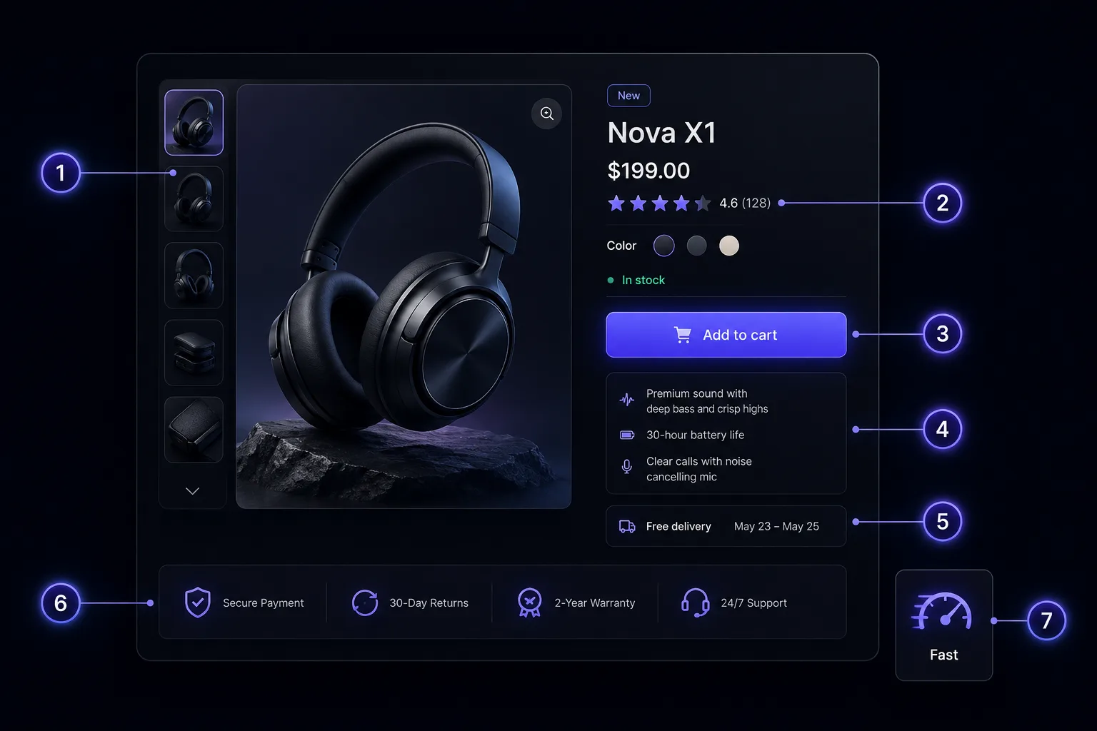
1. Lead with a clean hero image
The first image is your headline. Use a bright, uncluttered shot of the product on a clean background, large enough to fill the gallery on both desktop and mobile. Follow it with context shots—the product in use, scale references, and key detail close-ups—so shoppers can picture owning it. Aim for real, high-resolution photography over generic stock; compress every image to keep the page fast (see fix 7). The hero image should communicate what the product is before a single word is read.
2. Put ratings and reviews above the fold
Social proof is the strongest trust signal on a product page, so surface it early. Show the star rating and review count near the title—above the fold—so buyers see that other people have bought and liked the product before they scroll. Lower on the page, display the full reviews with photos where possible. New stores with few reviews can lead with other proof (UGC, press, "as seen in," or guarantees) while reviews accumulate. The goal is the same: reduce the buyer's perceived risk early.
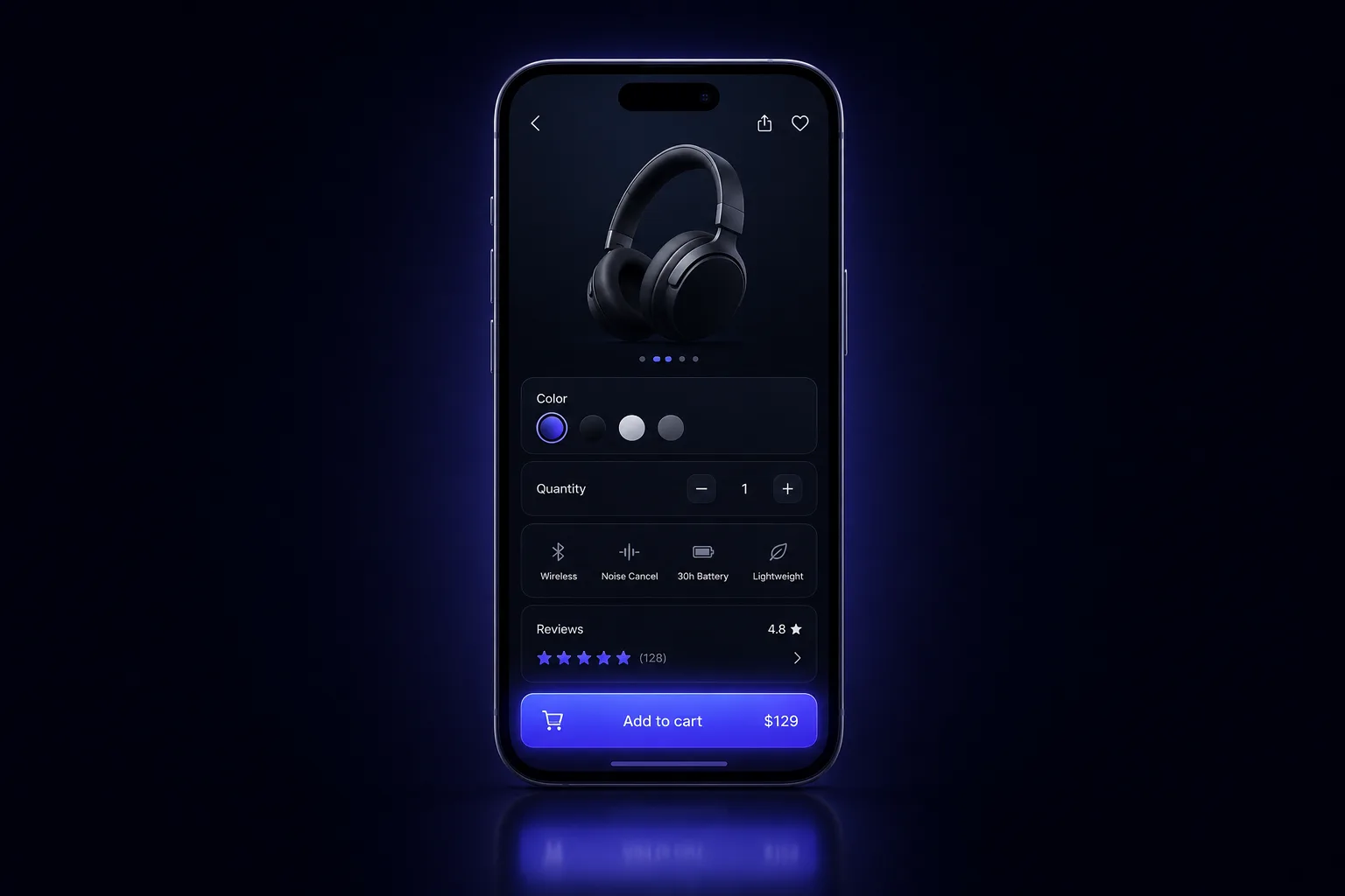
3. Make add-to-cart sticky on mobile
Most Shopify traffic is on a phone, and on mobile the add-to-cart button scrolls out of view fast. A sticky add-to-cart bar—pinned to the bottom of the screen as the shopper reads—keeps the primary action one tap away at all times. Keep the button high-contrast, full-width, and labelled clearly ("Add to cart"). This single mobile fix is one of the most reliable ways to lift add-to-cart rate on a PDP.
4. Write benefit-led copy, not a spec sheet
Specs answer "what is it?"—benefits answer "what's in it for me?" Open your description with the outcome the buyer wants, then back it with the features that deliver it. Use short paragraphs, scannable bullets, and bold key phrases so the copy can be skimmed in seconds. Keep the specs (materials, dimensions, care) in an expandable section for the detail-oriented shopper, but never make benefits compete with a wall of technical text. Write for the person, not the product database.
5. Show shipping cost and delivery time on the page
Unexpected shipping cost is one of the biggest reasons carts get abandoned. Don't make buyers reach checkout to find out what delivery costs or when it arrives. State shipping cost (or "free shipping over $X"), estimated delivery window, and returns terms right on the product page, near the buy box. Clarity here removes a major last-second objection and builds confidence before the shopper commits.
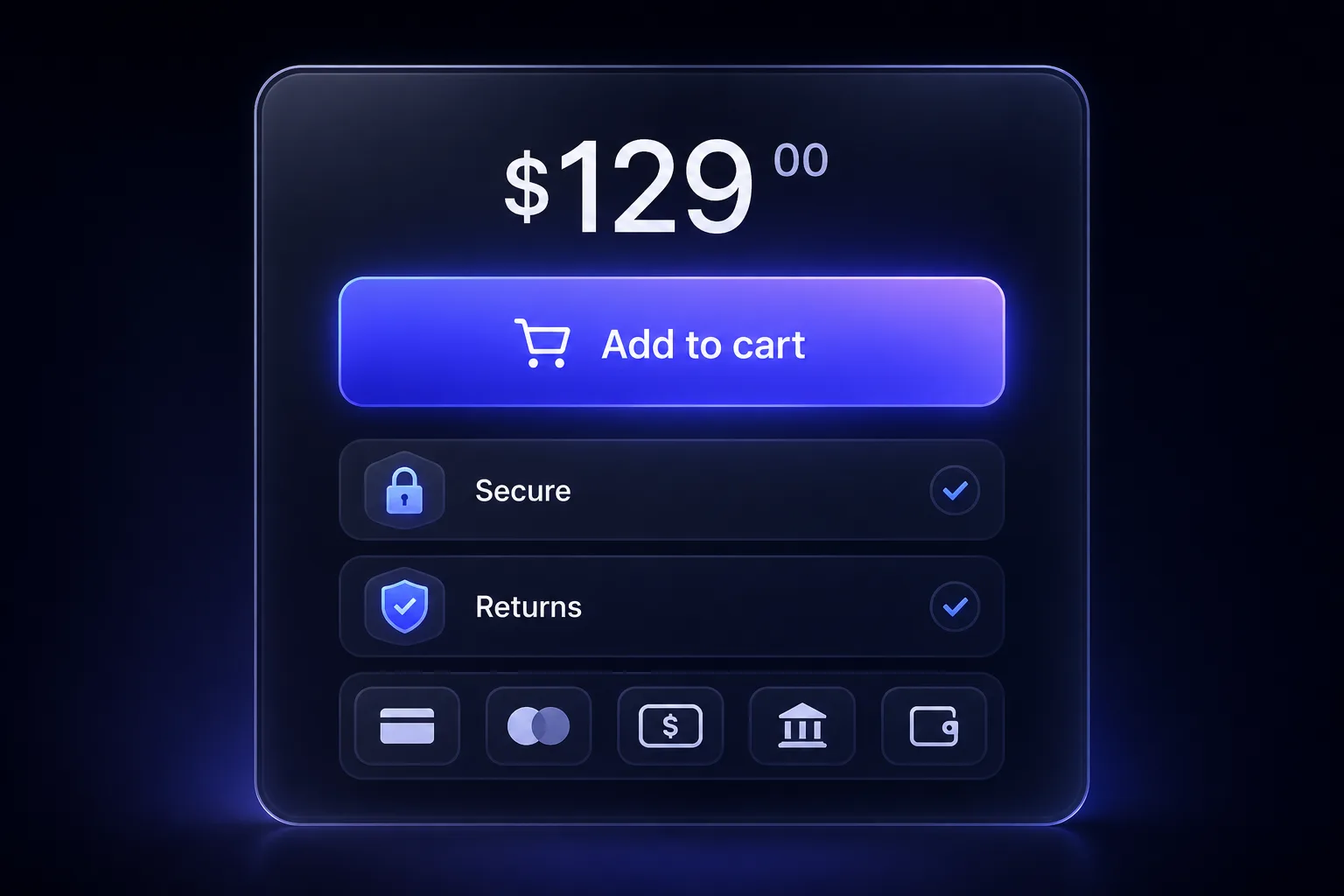
6. Stack trust at the buy box
The area around the add-to-cart button is prime real estate—use it to stack reassurance exactly where the decision happens. Cluster your strongest trust signals beside the price and button: secure-checkout badges, the returns/guarantee policy, payment options, stock or shipping cues, and a short value reminder. Each element answers a silent objection. Stacked together at the buy box, they make clicking "Add to cart" feel like the safe, obvious choice.
7. Fix speed and mobile structure
A fast, well-structured mobile page is the foundation everything else sits on—if the PDP is slow or awkward on a phone, the other six fixes never get a chance. Compress and lazy-load images, trim unnecessary apps and scripts, and keep the mobile layout in a logical order: image, title, price, rating, add-to-cart, then details. Test your real product pages on a mobile connection, not just desktop. Speed is both a conversion lever and a ranking factor, so it pays twice.
Your printable checklist
Run each top product page against these seven points—if you can't tick all seven, you have found your next win:
- Hero image: clean, high-res, fills the gallery; supported by in-use and detail shots
- Reviews: star rating and count visible above the fold; full reviews lower down
- Add-to-cart: sticky on mobile, high-contrast, always one tap away
- Copy: benefit-led and scannable; specs tucked into an expandable section
- Shipping: cost, delivery window, and returns shown on the page near the buy box
- Trust: badges, guarantee, payment options, and stock cues stacked at the buy box
- Speed and structure: images compressed and lazy-loaded; logical mobile order; tested on mobile
Grab the one-page PDF and tick the boxes as you go.
Common mistakes that cost you sales
- Burying the add-to-cart below long descriptions on mobile, with no sticky bar
- Hiding shipping and returns until checkout, so buyers bail at the last step
- Manufacturer copy pasted across every variant—generic, feature-heavy, and unconvincing
- Reviews far down the page (or missing entirely) so first-time buyers see no social proof
- Heavy, uncompressed images and excess apps that drag load time on mobile
- A cluttered hero that makes shoppers work to understand what the product even is
What good looks like
A high-converting Shopify product page lets a first-time mobile visitor understand the product, trust the brand, and reach checkout without friction. Within the first screen they see a clear hero image, the product title and price, a star rating, and a tap-ready add-to-cart. As they scroll, benefit-led copy answers "why this?", reviews and trust signals answer "why you?", and shipping and returns answer "what's the risk?". Nothing makes them hunt for information, and nothing makes them wait on a slow page. That is the bar to aim for on every PDP.
How Virexo Media helps with product page conversion
Auditing a checklist is the easy part—implementing it cleanly across a live theme, then proving the lift with testing, is where most teams stall. That is the work our Shopify development and CRO team does: we rebuild and optimize high-converting product pages, wire up reviews and trust elements, fix mobile speed, and pair it with performance marketing so the traffic you pay for actually converts. If SEO is the priority, our companion guide on Shopify product page SEO covers ranking PDPs, and the Shopify CRO audit checklist zooms out to the whole funnel.
The numbers behind the work: 80+ clients served, 50+ Shopify stores built, $2.4M+ in revenue scaled, and a 5.2x average ROAS across our ecommerce campaigns.
"The Shopify store they built for us is stunning and converts like crazy. Combined with their performance marketing, our revenue tripled in the first quarter."
— Ayesha Khan, E-Commerce Manager, LuxeWear (UAE)
Frequently asked questions
What makes a Shopify product page convert?
A converting PDP answers the buyer's questions fast: a clear hero image, the price and a tap-ready add-to-cart, visible ratings, benefit-led copy, trust signals at the buy box, and transparent shipping and returns—all on a page that loads quickly on mobile. The seven fixes above cover each of these in order of impact.
How do I improve my Shopify product page conversion rate?
Start with the highest-impact, lowest-effort fixes: add a sticky mobile add-to-cart, move ratings above the fold, and surface shipping cost and delivery time on the page. Then rewrite copy to lead with benefits, stack trust signals at the buy box, and compress images for speed. Change one element at a time and watch add-to-cart and checkout rates.
Where should reviews go on a product page?
Put the star rating and review count above the fold, near the product title, so first-time buyers see social proof immediately. Display the full reviews—ideally with customer photos—lower on the page where shoppers go for detail before deciding.
Should the add-to-cart button be sticky on mobile?
Yes. Most Shopify traffic is mobile, where the add-to-cart button scrolls out of view quickly. A sticky bar pinned to the bottom of the screen keeps the primary action one tap away as the shopper reads, and it reliably lifts add-to-cart rate.
How many images should a Shopify product page have?
There is no magic number, but most high-converting PDPs use a clean hero shot plus several supporting images: the product in use, scale or fit references, and key detail close-ups. Quality and relevance beat quantity—every image should answer a question or remove a doubt, and all of them should be compressed for speed.
Ready to turn product pages into profit?
Virexo Media helps D2C and Shopify brands build high-converting stores and the campaigns that feed them. Book a free strategy call and we'll review your top product pages and send a prioritized action list within 48 hours.
Explore our website development, performance marketing, and SEO services pages.
Want a free audit of your store?
Book a 15-minute call with Virexo Media. We'll review your Shopify site, ads, or SEO — and send a prioritized action list within 48 hours. No pitch deck. Just clarity.