Shopify Store Glow-Up: 6-Zone Conversion Checklist
The Shopify store glow-up checklist: 6 conversion zones—hero, navigation, product pages, trust, mobile speed, and checkout—with 40+ checkpoints and a quick win for each.
Your store doesn't need more traffic—it needs to convert the traffic it already has. This Shopify store glow-up checklist is the exact storefront makeover we run on D2C client stores before we ever touch their ad budget: six conversion zones, 40+ checkpoints, and a quick win you can ship in each. Work through it zone by zone, top to bottom—the top of the page does the heaviest lifting. It's the same pass behind our Shopify design and CRO builds, and it pairs well with our store leak audit.
Prefer the printable version? Download the free Shopify Store Glow-Up Checklist (PDF)—all six zones and quick wins on one page.
What's inside this checklist
- The 6 conversion zones, in the order to fix them
- A short checklist plus a "ship today" quick win for each
- The do-this / not-that for a high-converting storefront
- The five storefront leaks that quietly kill conversions
- A realistic "what good looks like" benchmark
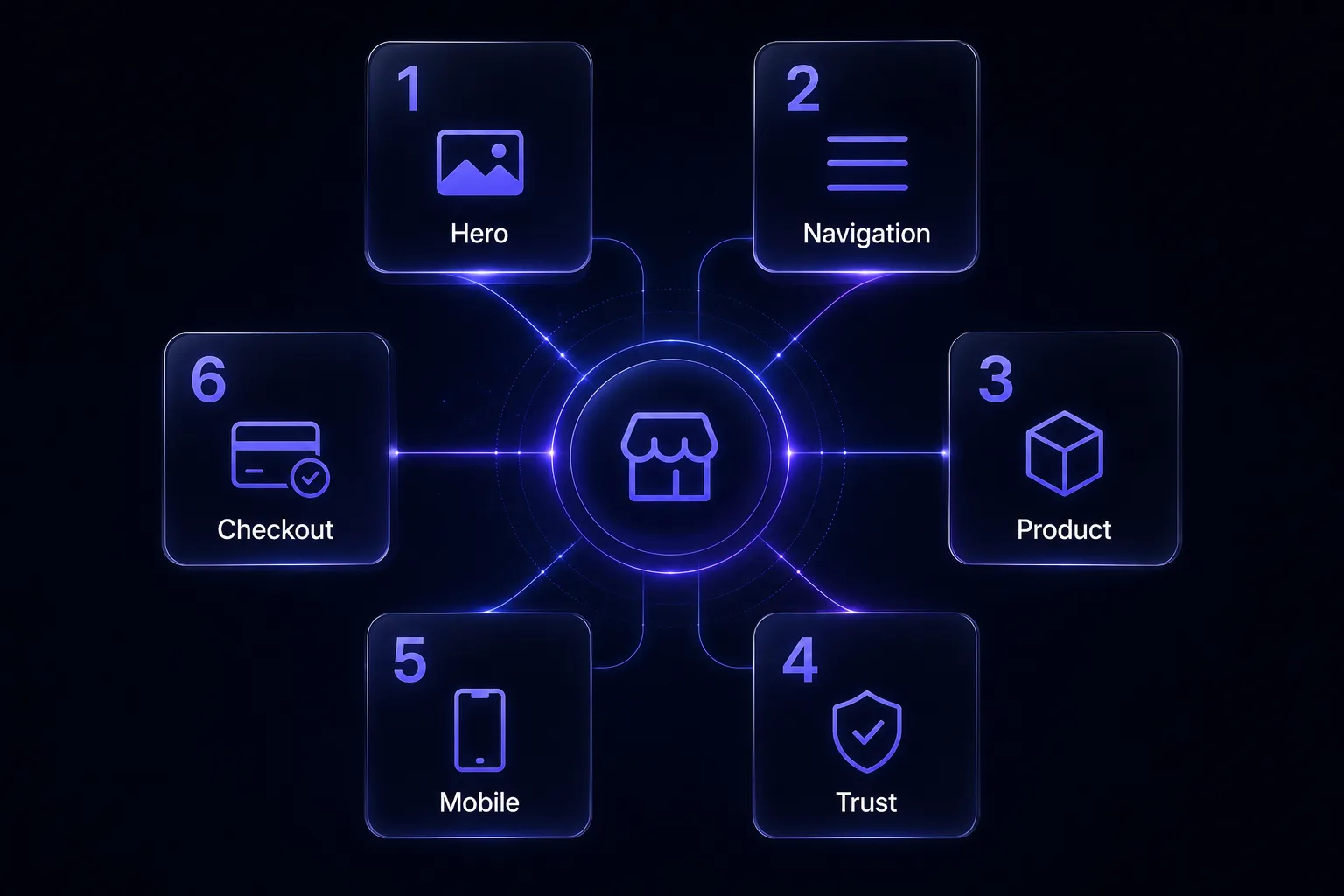
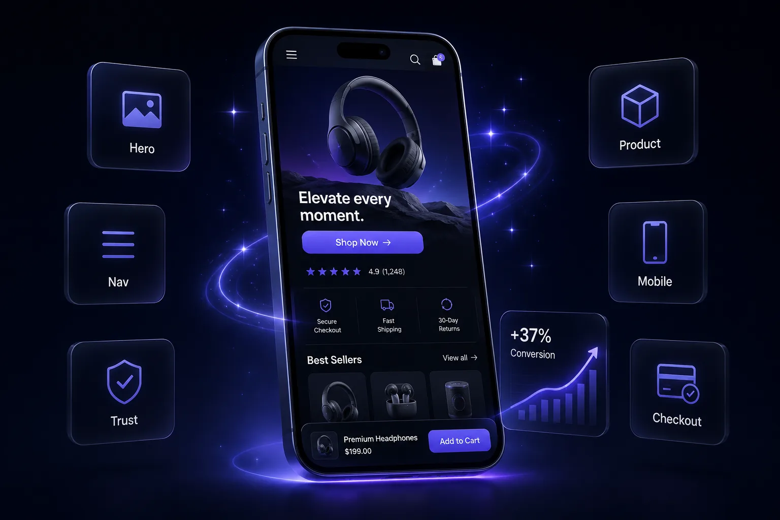
Zone 1 — Above-the-fold / hero
The first screen on mobile decides whether they stay—you have about 7 seconds.
- One clear headline that says what you sell and who it's for—not a vague slogan.
- A single, high-quality hero image or short video of the actual product in use.
- One primary call-to-action button, visible without scrolling, in a contrasting color.
- A one-line value prop or proof point under the headline (free shipping, guarantee, rating).
- No carousel auto-sliders—they hide your message and slow the page.
Quick win: rewrite your hero headline to the formula "[Outcome] for [who]—[the differentiator]." Ship it today.
Zone 2 — Navigation & search
If they can't find it in two taps, they leave.
- A menu of 5–7 items max, named the way customers think ("Shop", not "Collections").
- A visible search bar (60%+ of high-intent shoppers use it).
- Best-sellers or a clear "Start here" path within one tap of the homepage.
- A sticky header so the cart and menu follow the scroll.
Quick win: add a "Best Sellers" link to your main menu—it's the highest-converting collection you have.
Zone 3 — Product pages
This is where the sale is actually won or lost.
- Multiple images: in-use, scale, detail, and at least one with a text-on-image benefit.
- Benefit-led bullets above the fold; the full description below for the readers.
- Price, shipping, and returns visible without scrolling.
- Reviews/ratings near the buy button, not buried at the bottom.
- A bold, single add-to-cart button that contrasts with everything around it.
Quick win: move your review stars directly under the product title—social proof at the decision point lifts add-to-carts. (More in the product page checklist.)
Zone 4 — Trust & social proof
New visitors don't know you. Borrow credibility everywhere.
- Real customer reviews with photos—on the homepage and product pages.
- Trust badges near checkout (secure payment, guarantee, easy returns).
- An honest returns/guarantee policy stated in plain language.
- A visible "About" story so the brand feels like real people.
- User-generated content or a tagged-photos section if you have it.
Quick win: add a money-back or satisfaction guarantee line under the buy button—it removes the #1 hesitation.
Zone 5 — Mobile & speed
Most of your traffic is on a phone, and most of it is impatient.
- Pages load in under ~3 seconds on mobile (test on a real phone, not just desktop).
- Compressed images and a lightweight theme—no app bloat you don't use.
- Thumb-sized tap targets and buttons; text legible without zooming.
- A sticky add-to-cart on mobile product pages.
- No intrusive pop-up the instant the page loads.
Quick win: audit your installed apps and delete every one you don't actively use—each adds load time.
Zone 6 — Cart & checkout CTAs
The last few taps leak the most money.
- A free-shipping threshold shown in the cart with progress ("$12 away from free shipping").
- Express checkout (Shop Pay / Apple Pay / Google Pay) enabled.
- No surprise costs—show shipping and totals early.
- One clear CTA per step; remove distractions and extra links at checkout.
- An abandoned-cart email/SMS flow live to recover the drop-offs.
Quick win: turn on Shop Pay and a free-shipping bar today—two of the fastest conversion lifts on Shopify. (Full detail in the cart-recovery playbook.)
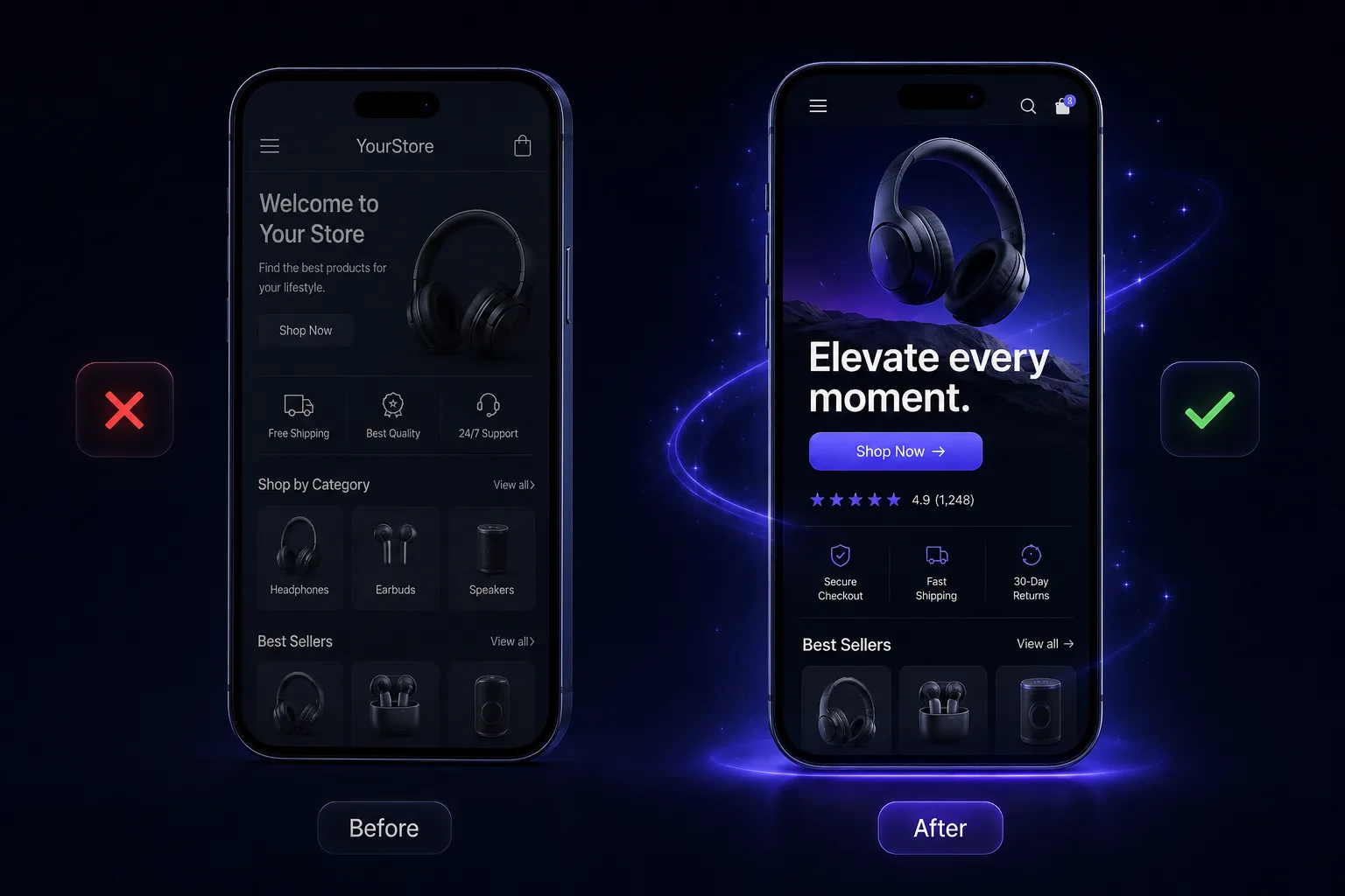
Do this, not that
Do this: one primary action per screen · lead with benefits and proof · design mobile-first · show price, shipping & returns early.
Not that: auto-playing hero carousels · stock photos with no people · walls of feature jargon · hiding reviews at the bottom.
The mistakes that quietly kill conversions
- Designing for desktop. The store looks great on a laptop and falls apart on the phone, where 70%+ of traffic actually is.
- A vague hero. A pretty image and a clever tagline that never says what you sell or why it's better.
- Proof buried. Great reviews exist, but they're three scrolls below the buy button instead of next to it.
- Too many choices. Five buttons, three pop-ups, and a mega-menu—so the visitor chooses nothing.
- Speed neglected. App after app added over time, each shaving conversion off every single visit.
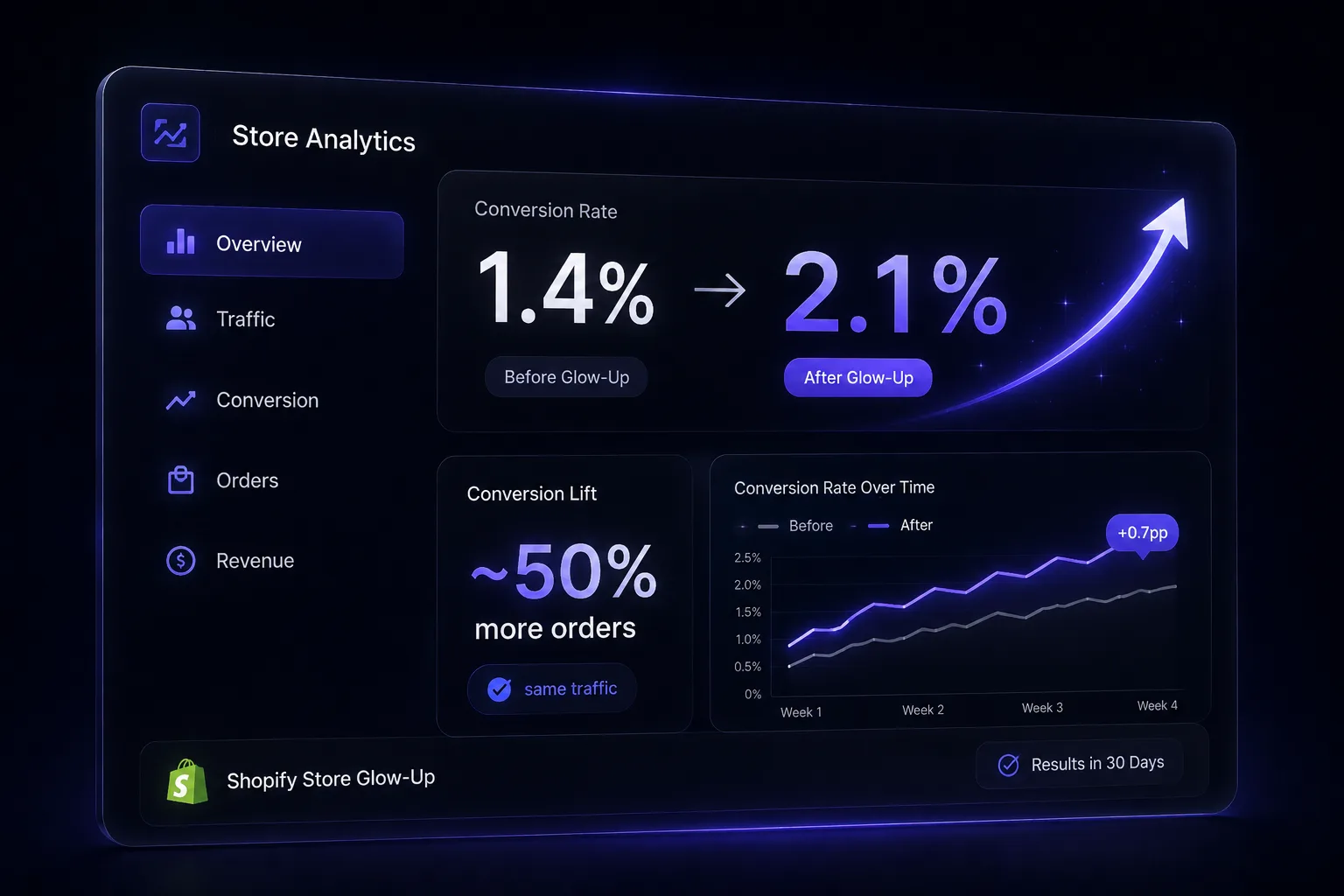
What good looks like
Illustrative example—hypothetical figures. Take a store getting 10,000 visits a month at a 1.4% conversion rate. Nothing changes about the traffic—only the storefront gets the glow-up above: the hero is rewritten with a single CTA that clarifies the offer in 7 seconds, reviews move to the buy button for proof at the decision point, and Shop Pay plus a free-shipping bar cut checkout drop-offs. Result (illustrative): 1.4% → 2.1% conversion—the same traffic producing ~50% more orders. (Figures are illustrative to show the mechanism, not a guaranteed or client-specific result.)
How Virexo Media helps with your store glow-up
We design and rebuild high-converting Shopify stores for D2C brands—hero to checkout, mobile-first, built to turn the traffic you already have into revenue. You bring the product; we build the store that sells it. When you want a designer's eye on it—or you'd rather hand the whole rebuild to a team that does this every day—that's our website development and CRO work, paired with the store audit and funnel that surround it.
The numbers behind the work: 80+ clients served, 50+ Shopify stores built, $2.4M+ in revenue scaled, and a 5.2x average ROAS across our ecommerce campaigns.
"Virexo Media rebuilt our entire website on React and ran our ad campaigns from scratch. Within two months we had a 4x return on ad spend and a site that actually converts."
— David Chen, Founder, DataPulse (Canada)
Frequently asked questions
What is a Shopify store glow-up?
It's a focused storefront makeover across the six zones that drive conversion—hero, navigation, product pages, trust, mobile/speed, and cart/checkout. The goal isn't a redesign for its own sake; it's converting more of the traffic you already have, without spending more on ads.
How do I increase my Shopify conversion rate without more ads?
Fix the six zones in order, starting with the hero (it does the heaviest lifting). Clarify the offer above the fold, move reviews next to the buy button, tighten navigation, speed up mobile, and turn on express checkout. Each is a fixable leak, not a traffic problem.
What should be above the fold on a Shopify store?
One clear headline that says what you sell and who it's for, a single high-quality hero image or video of the product in use, one primary CTA in a contrasting color, and a one-line proof point (rating, guarantee, or free shipping). Skip auto-playing carousels.
How many items should my store's menu have?
Five to seven, named the way customers actually think ("Shop", not "Collections"), plus a visible search bar—60%+ of high-intent shoppers use search. Keep a best-sellers or "start here" path within one tap of the homepage.
What's the fastest conversion win on Shopify?
Turn on Shop Pay and add a free-shipping progress bar—two of the quickest lifts on the platform—and move your review stars directly under the product title. All three put proof and ease right at the decision point.
Ready to give your store the glow-up?
Virexo Media designs and rebuilds high-converting Shopify stores for D2C brands—mobile-first, hero to checkout. Book a free strategy call and we'll run this glow-up pass on your store and send a prioritized action list within 48 hours.
Explore our website development, performance marketing, and SEO services pages.
Want a free audit of your store?
Book a 15-minute call with Virexo Media. We'll review your Shopify site, ads, or SEO — and send a prioritized action list within 48 hours. No pitch deck. Just clarity.